Timbre from an artist’s point of view
by Adinda van 't Klooster
In literature about music, timbre is often referred to as ‘the colour’ of a sound. When a trumpet and a saxophone play the same tune in exactly the same way, the difference in the experience of the sound lies in the timbre of the instrument. It is the same with voices, where two people can sing the same tune but still sound distinctly different. It is not only intonation but also timbre that can make one person’s voice pleasant and another person’s voice highly unpleasant. Scientifically speaking timbre is the changing spectral distribution of a sound over time (Risset and Wessel 1999), but it can change in many different ways. So what is really meant with timbre? The use of the word colour to refer to timbre is perhaps wrong footing us; a complex spectrum containing many partials is not just analogous to a single colour frequency, after all. Perhaps pitch is the better candidate to be linked to colour. In the 1980s, psychologists investigated a phenomenon called ‘pitch-brightness’ that showed that people linked brighter colours (like yellow) to higher pitched sound than darker colours (Marks, 1982). Musical textures arise from timbre; analogously, textures within images may be better linked to timbre. Perhaps musical timbre then is better mapped to the texture or even ‘line’ of the image.
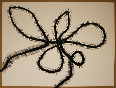
Consider the drawing I made last week shown below.

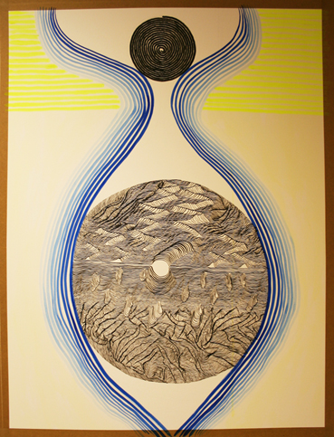
I am not synaesthetic myself but looking at this drawing I can’t help hearing a raspy sort of sound, coarse to the ear. The way the lines interact suggest friction. This is caused by the hairy or leafy protusions of the thicker line and by the crossing of the thicker line with itself. Now compare this drawing to the next drawing below, that I made thinking about ways to visualise timbre, and look at the highly detailed line drawing in the larger circle.

The lines interact with themselves in a much more gentle manner, and build a landscape, a texture with a certain roughness that is more pleasant to bear, perhaps because it mirrors nature. Each line follows the next, with only minor changes each time a line repeats. If I were to sonify this part of the drawing the difference in quality with the previous sound would be in its timbre. I hear a multilayered sound a bit like the sound of the sea, a hiss that changes gradually, waxes and wanes, slightly calming because of its ongoing similarity. Pitch is not an important component here. If I were to give you the spectrogram of my imagined sound, it would cover a large part of the spectrum. Now compare the large circle with the smaller black circle above. It consists of a single line that follows itself in a circle. There is less texture, but still some. This sound would have a more constant nature, and cover a smaller proportion of the spectrum, thus being more akin to an acoustic instrument, with a clearly recognizable spectral stamp.
If I were to sonify this drawing as a whole, I would still have to do something with the blue and the neon yellow lines. The neon lines are straight and close to each other, covering slightly less than the top third part of the paper. I would say it’s a bright sound, at a fairly high pitch, repeating itself over and over, without a very wide frequency distribution. And finally, the blue lines: they create a curvy shape, it could be an eye or a part of the female body (you choose which) or even a bomb-like shape. It holds the drawing together structurally and gives a key identity to the drawing. Should this be the melody? I am not sure, as earlier I said colour could strongly relate to pitch. But it should surely bind the other elements together. I think I will ponder this over for a week. Perhaps you have any suggestions? If you do please share them with me by using the comment section below. I would be interested in what you have to say and will share any interesting suggestions in next week’s blog.


