Affect Formations

in art and music

Blog

Post Archive | RSS

Archives

Preparing a concert system which tracks performer felt emotional state through physiological sensors

February 6th at 1:20pm

Guest blog by Nick Collins

We're now in the later intensive stages of building a new concert system which uses physiological sensors, working title 'BioCombat'. The idea is that Adinda and I will each wear three physiological sensors (skin conductance, heart rate and single channel EEG), and that personalized classifiers can be built to track our emotional state live. There will be a 'battle of emotions' where the two of us have to compete to best feel a target emotion (which changes over time and is dictated by the computer), the winner at a given moment controlling the audiovisual output. Much of the graphics and audio side of the system is built, and the last few weeks of preparation will see integration with the live physiological tracking.

This blog post is about the creation of the classifier itself, a machine learning task. Adinda and I have been recording ourselves in eight different emotional states: "calm", "sad", "annoyed", "scared", "angry", "excited", "happy" and "tender". We've invoked these states in ourselves by listening to personally selected music examples that promote those emotions, and thinking about events in our lives relating to them. Now, I'm testing the classification machinery to see how well different emotional states can be distinguished from the physiological data.

The physiological sensor output isn't used directly, but instead ten derived features (statistics and signal characteristics) are extracted from the sensor data, over windows of a few seconds (the window size can be varied and is one parameter to explore). I use an open source toolbox for the SuperCollider audio programming language I've developed called SCMIR (http://composerprogrammer.com/code.html), with the benefit that it works well for preparing machine listening and learning tasks like signal classification, and once trained up the classifiers can easily be deployed live in the concert.

The process was prototyped already on some early data, using three different machine learning algorithms: a neural net, naive Bayes, and k nearest neighbours classification. Data from each emotional state was labelled with that state; the task was to get the correct state label, given the data. In each case, half the data formed a training set to prepare the algorithm, and its real world generalised performance was tested on the remaining data (e.g. data it hadn't seen in training). A typical decent performance for the naive bayes algorithm on two second window data was around 90% success on the training data (where we'd expect it to do well) and at most 60% on unseen data. Chance is at 1 in 8, 12.5%, so there is definitely an improvement in using the classifier.

However, there is research (Picard et al. 2001, Kim and André 2008, van den Broek et al. 2009) which alludes to the possibility of better performance achievable on individual data (it would be a harder task still if the system had to generalise across human beings since humans can differ substantially in their physiological baseline). The projects described in these papers utilise some different features from those we've chosen, but also aren't explicitly trying to build a concert system. In my experience, trying to bring such sensing and learning technologies to realtime concert use presents particular challenges over and above the purer laboratory research setting. Nonetheless, armed with additional data (collected over multiple sessions over multiple days), the task right now is to see if the classification results can be improved further. It remains a challenging situation; there is more data both to train and also test systems (which may have a nullifying effect), and since the data is over multiple days, there will be within person physiological variation day to day to contend with. The hope, however, is that a more robust classifier can be built for the concert. It remains to be seen if any performance nerves themselves skew the final performance situation!

Picard, R. W., Vyzas, E., & Healey, J. (2001). Toward machine emotional intelligence: Analysis of affective physiological state. Pattern Analysis and Machine Intelligence, IEEE Transactions on, 23(10), 1175-1191.

Kim, J., & André, E. (2008). Emotion recognition based on physiological changes in music listening. Pattern Analysis and Machine Intelligence, IEEE Transactions on, 30(12), 2067-2083.

van den Broek, E. L., Lisy, V., Westerink, J. H., Schut, M. H., & Tuinenbreijer, K. (2009). Biosignals as an advanced man-machine interface. research report IS15-IS24
See full post and comments →

Can you make science out of art?

January 15th at 5:38pm

By Adinda van 't Klooster

Preparations for the live audiovisual concerts are progressing well. Yesterday during a rehearsal John Snijders and Nick Collins both played to the ‘In a State’ interface and it was really interesting to see the different interpretations/playing styles of the two most excellent improvising pianists of the North East. It was also the first time for me to hear John interpret the first graphical score I posted in an earlier blog. It was very inspiring to hear my drawing most originally transformed into piano waves and lines just as I had drawn on paper. John also has the most extraordinary way of treating the lower register of the piano, creating sounds that I have never heard come out of a piano before.

We have also been making progress on the second interface, as of yet without a title, that uses sensors that record physiological responses like heart rate, brainwaves and perspiration. The data will be used to estimate what the musicians feel during the performance. Using a subset of the eight emotions: happy, sad, tender, calm, excited, scared, angry and annoyed these emotions will be visualised through animated drawings. The findings of the online research survey on this site will directly influence the performance as it helps me to choose which graphics are best at expressing these eight emotions. The survey has so far been completed by 27 participants, but more participants are needed so please participate by clicking the participate button at the top of the screen.

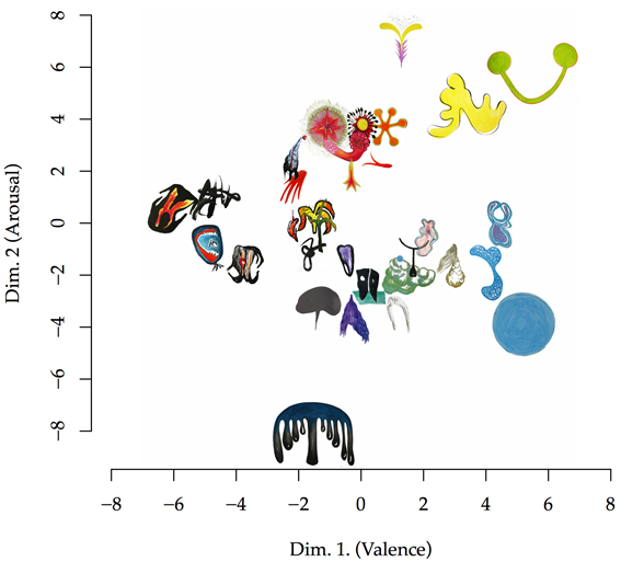
Tuomas Eerola helped me make the very interesting graph below, which shows how similar the abstract 32 drawings in the survey are thought to be in terms of what they express emotionally, according to the 27 participants who so far participated. Using the survey results he was able to compute and plot the distances between the images using the eight emotions. The result is a two-dimensional projection of the similarity of the images in terms of emotions, in a familiar affective space using valence and arousal (Russell, 1980). The drawings overlap slightly where they are though to be more similar and when an image is bigger this reflects how clearly it was able to express the main emotion. Naturally an image like this poses many questions. Can we really make science of art in this way, i.e.: is it meaningful? I would say it is certainly quite useful to see if the message intended is also received even if it not always the aim of an artist to be clear about the meaning. Sometimes the aim is to be ambiguous and intrigue rather than to express something in a clear manner but it is certainly also interesting to see that abstract images can also be quite clear. I also wonder how this graph will change when more people take the survey. Do help us find out by taking the survey , if you have not already done so!

file Image by Tuomas Eerola and Adinda van 't Klooster

References

Russell, J.A. (1980), A Circumplex Model of Affect, Journal of Personality and Social Psychology, 39, p.1161-1178.

See full post and comments →

Which music makes you angry? + HD movie release of Durham Talk 'Affect Formations in Art and Sound'

December 22nd at 3:10pm

by Adinda van 't Klooster

Work on the second interface for the live performances in 2015 has been progressing. We (myself and Nick Collins) have now captured our biosignals listening to particular pieces of music that induce us into one of the eight target states. We both chose different pieces of music, as it tends to be very personal in terms of which music works to induce the particular emotions. We needed two minutes of music per state, one minute to allow the person to start feeling the emotion and another to capture the biodata. If the extract wasn’t long enough it was looped. I chose the following extracts of music for the following emotions:

Happy: Fuga 3 from the Well-tempered Clavier by J.S. Bach

Angry: Untitled (7_53) by Merzbow (from the album Oersted)

Sad: Fratres For 8 Cellos by Arvo Part (by the Hungarian State Orchestra conducted by Tamás Benedek)

Excited: Extract from the soundtrack for ‘Batman Returns’ by Danny Elfman

Scared: ‘Dear Clarence’ by Hans Zimmer, from the soundtrack for ‘Hannibal’

Annoyed: Hyperprisme, for winds and percussion, Varese: The Complete Works, ASKO ensemble directed by Riccardo Chaily

Calm: Metamorphosis 4 by Phillip Glass (from the album the Essential Phillip Glass)

Tender: Book of Ways 12, Keith Jarrett (from the album Rarum 1)

The hardest one to find was music that made me angry. Although there is a lot of music that makes me annoyed, it is much harder to get me angry; when I have control over the volume button that is… Scared was also a difficult one. It is easy to know when you are supposed to feel scared but without visuals and only music it can be quite hard to be induced into real fear. The data of the biosignals is now used to create a classifier. More on this in the New Year.

In the meantime, 24 people have done the online survey. Thanks very much to those who took the time! But we still need more people to do it so please channel your generous Christmas spirit into donating ten minutes of your time to take the survey. Just click the participate button at the top right of this screen and you will be guided through. Only surveys that are fully completed will be used and all data remains anonymous.

Let me finish with my Christmas gift to you all: The HD edited version of the talk I gave at Durham University on the 11th of November 2014. The talk was about my previous artworks that have been inspired by music in different ways and the work I am currently developing at Durham University with staff of the music department. With many thanks to the excellent editing of Simone Tarsitani, https://www.dur.ac.uk/music/staff/profile/?id=8712, and the great camera work of Martin Clayton, https://www.dur.ac.uk/music/staff/profile/?id=8712, Laura Leante, https://www.dur.ac.uk/music/staff/profile/?id=8711 and Tat Amaro. Just click the expand screen button if you would like to watch the movie at full size.

See full post and comments →

Timbre from an artist’s point of view

December 10th at 5:51pm

by Adinda van 't Klooster

In literature about music, timbre is often referred to as ‘the colour’ of a sound. When a trumpet and a saxophone play the same tune in exactly the same way, the difference in the experience of the sound lies in the timbre of the instrument. It is the same with voices, where two people can sing the same tune but still sound distinctly different. It is not only intonation but also timbre that can make one person’s voice pleasant and another person’s voice highly unpleasant. Scientifically speaking timbre is the changing spectral distribution of a sound over time (Risset and Wessel 1999), but it can change in many different ways. So what is really meant with timbre? The use of the word colour to refer to timbre is perhaps wrong footing us; a complex spectrum containing many partials is not just analogous to a single colour frequency, after all. Perhaps pitch is the better candidate to be linked to colour. In the 1980s, psychologists investigated a phenomenon called ‘pitch-brightness’ that showed that people linked brighter colours (like yellow) to higher pitched sound than darker colours (Marks, 1982). Musical textures arise from timbre; analogously, textures within images may be better linked to timbre. Perhaps musical timbre then is better mapped to the texture or even ‘line’ of the image.

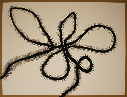
Consider the drawing I made last week shown below.

file

I am not synaesthetic myself but looking at this drawing I can’t help hearing a raspy sort of sound, coarse to the ear. The way the lines interact suggest friction. This is caused by the hairy or leafy protusions of the thicker line and by the crossing of the thicker line with itself. Now compare this drawing to the next drawing below, that I made thinking about ways to visualise timbre, and look at the highly detailed line drawing in the larger circle.

file

The lines interact with themselves in a much more gentle manner, and build a landscape, a texture with a certain roughness that is more pleasant to bear, perhaps because it mirrors nature. Each line follows the next, with only minor changes each time a line repeats. If I were to sonify this part of the drawing the difference in quality with the previous sound would be in its timbre. I hear a multilayered sound a bit like the sound of the sea, a hiss that changes gradually, waxes and wanes, slightly calming because of its ongoing similarity. Pitch is not an important component here. If I were to give you the spectrogram of my imagined sound, it would cover a large part of the spectrum. Now compare the large circle with the smaller black circle above. It consists of a single line that follows itself in a circle. There is less texture, but still some. This sound would have a more constant nature, and cover a smaller proportion of the spectrum, thus being more akin to an acoustic instrument, with a clearly recognizable spectral stamp.

If I were to sonify this drawing as a whole, I would still have to do something with the blue and the neon yellow lines. The neon lines are straight and close to each other, covering slightly less than the top third part of the paper. I would say it’s a bright sound, at a fairly high pitch, repeating itself over and over, without a very wide frequency distribution. And finally, the blue lines: they create a curvy shape, it could be an eye or a part of the female body (you choose which) or even a bomb-like shape. It holds the drawing together structurally and gives a key identity to the drawing. Should this be the melody? I am not sure, as earlier I said colour could strongly relate to pitch. But it should surely bind the other elements together. I think I will ponder this over for a week. Perhaps you have any suggestions? If you do please share them with me by using the comment section below. I would be interested in what you have to say and will share any interesting suggestions in next week’s blog.

1. Risset, J.C. and Wessel, D.L., (1999) Exploration of timbre by analysis and synthesis, The psychology of music, volume 28, Academic Press

2. Marks, E. (1982), Bright Sneezes and Dark Coughs, Loud Sunlight and Soft Moonlight, Journal of Experimental Psychology: Human Perception and Performance, April 1982, Volume 8, Number 2, p.177-193.

See full post and comments →

First impressions count in music

December 3rd at 3:03pm

Guest blog by Tuomas Eerola

How is emotional expression initially conveyed by music? Primarily through the colour of the sound, known as timbre, before other musical parameters such as tempo, harmony, pitch, and structure have a chance to impart their stamp on the expression. Musical instruments differ radically in timbre despite them being able to play the same pitch and loudness. The timbre differences may be characterised in terms of adjectives such as bright, warm, nasal, or harsh, and these have a tangible connection to emotional expression of music.

Timbre conveys an immediate impression about the identity of the sound to the listener. Listeners are able to make a distinction between neutral and emotional expression (Filipic et al., 2010), determine the genre of music (Gjerdingen & Perrot, 2008) in a quarter of a second (examples below), and, estimate reliably whether the sound is vocal or not from tiniest (8 ms, that is 1/125th of a second!) of fragments (Suid et al., 2014).

To get a sense of this, feel free to listen few excerpts from Gjerdingen and Perrot's classic study:

We infer softness, warmth, movement and size, energy, and even possible hostility about the sound source. Some of these properties describe the physical aspects of the sound, but also about the social intentions or states. This idea is related to our own body-states in affective experiences: Pleasant affective states are reflected in faucal and pharyngeal expansion, which is physiological jargon for wide relaxed voice. This manifests in relatively more low- than high-frequency energy. The high-arousal emotions such as anger is related to an increase in high-frequency energy and its variability. In fact, these couplings are even partly shared by some primates. Hence, the mapping between acoustic properties and emotional expression is rooted in biology.

The past research has explored the good, bad and ugly aspects of sounds. My personal favorite in this line of work is titled "Scraping sounds and disgusting noises" by Trevor Cox. He had over million people rating a small selection of horrible sounds, including vomiting, microphone feedback and the noise from many babies crying at the same time, which were actually the worst sounds in the selection.

In a musical domain, disgusting sounds are not typically sought after but a broad palette of sound colours are of course utilized. In my work on emotions and music, I wanted to know whether musical instruments themselves and their sounds carry clear affective associations. To explore this, I got hold of 1-second long instrument sounds that were identical in frequency, loudness and duration, asked listeners to evaluate their affective qualities. They rated a reedy saxophone [example below] to be tense and energetic, a guitar pluck as pleasant and relaxed and so on. The affective qualities of all clips could then be directly connected to the acoustic qualities of the sounds.

This experiment was simply scratching the surface of the possibilities that timbre can offer to research of emotions in music. Timbre talks to us in a very direct fashion about the affective qualities of other beings. Composers – from Wagner, Scriabin, Messiaen, to Saariaho, and Lachenmann – have been keen to exploit the possibilities of timbre, first with sophisticated orchestration techniques and later with the aid analog and digital technology. In research, we are catching up the ideas of the great composers by turning more attention to the intriguing ways timbre is able to convey affects, sensations and associations. The new collaboration between artist Adinda van ‘t Klooster (Leverhulme sponsored Artist in Residence) and music scholars at Durham University (Collins and Eerola) offers a great opportunity to explore these connections simultaneously from artistic and empirically-grounded scientific vantage points.

References

See full post and comments →

The research project needs your help!

Participate